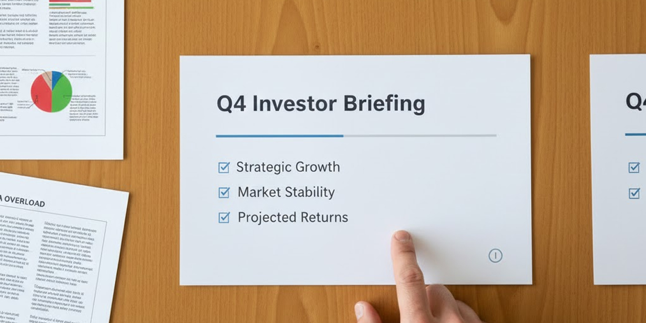
The Silent Weight of Layout: How Spatial Decisions Shape Investor Perception Before You Speak

Design is often reduced to color, typography, and aesthetics, but in high-stakes communication, layout does more than organize content—it dictates how investors interpret logic, trust signals, and operational maturity. Before a single word is spoken, the spatial arrangement of a slide reveals whether a founder understands clarity, prioritization, and the psychology of attention. A good layout is not decoration; it is a cognitive scaffold.
Many founders underestimate how quickly layout signals competence. Uneven spacing, misaligned elements, oversized visuals, and cramped text create immediate friction. Investors don’t consciously analyze these cues; they simply register the deck as harder to read, harder to trust, and harder to believe. The eye feels the disorder long before the brain articulates it. Good layout eliminates this friction, guiding the audience smoothly from insight to insight without forcing them to search.
Why Layout Is a Narrative Decision, Not a Design Choice
Layout determines where the story begins, where tension builds, and where insight lands. A slide with competing focal points diffuses narrative force; a slide with a clear hierarchy strengthens it. When content is visually weighted in proportion to its strategic importance, investors feel pulled through a coherent arc. When it is not, the story flattens, and even strong insights lose impact.
Founders often blame weak storytelling on the content itself, when the real culprit is spatial confusion. A critical metric buried among secondary details loses its authority. A strategic insight placed at the bottom of a slide appears optional. A chart surrounded by unnecessary labels looks less confident. In each case, the narrative collapses not because the story is wrong but because the layout contradicts it.
The most successful decks resolve this tension by making layout serve the argument. The hierarchy is unmistakable. Key ideas take visual precedence. Supporting details recede. White space gives the viewer time to think. The slide becomes a stage where strategic moments land with precision.
The Spatial Signals That Influence Investor Trust
Certain layout patterns consistently shape investor perception. These patterns appear across institutional decks, advisory presentations, and high-confidence fundraising materials. They signal a disciplined operator who understands how communication reflects execution.
Investors subconsciously look for:
- Consistent alignment that suggests attention to detail.
- Adequate breathing room that conveys confidence and clarity.
- A dominant focal point that removes ambiguity.
- Logical proximity of related elements that reflects structured thinking.
- Predictable placement of titles and labels that reduces cognitive load.
These cues don’t make the slide “prettier.” They make it legible, authoritative, and trustworthy. Layout becomes the bridge between insight and belief.
When Layout Breaks the Story
A poor layout doesn’t just distract—it actively undermines narrative logic. A slide packed edge-to-edge communicates desperation. A slide with multiple competing clusters communicates indecision. A slide with no hierarchy communicates inexperience. Investors don’t see these issues as design flaws; they see them as execution flaws, symptoms of a team that has not yet refined its thinking.
The most damaging layouts are the ones that contradict the intended message. A “highly focused strategy” slide with scattered elements feels dissonant. A “clear path to profitability” slide that forces investors to hunt for numbers feels unconvincing. A “simple value proposition” slide overloaded with text feels disorganized. Layout becomes the silent metric that evaluates the team’s maturity.
What makes layout powerful is that it operates beneath conscious scrutiny. Investors rarely comment on it directly, but it shapes everything—from how fast they understand a point to how credible they perceive the founder to be. When layout and narrative are aligned, the deck feels coherent. When they diverge, the deck feels amateur.
The Real Purpose of Layout in High-Stakes Storytelling
The best layouts do not call attention to themselves. They reduce effort, sharpen meaning, and accelerate comprehension. They keep investors oriented even when the material becomes complex. They create an intuitive sense that the presenter is in control of the room and the idea.
Above all, they transmit discipline. A clean layout tells investors that the team knows how to prioritize, how to structure information under pressure, and how to maintain clarity even as the business grows in complexity. It signals the presence of operational rigor long before the team discusses process or execution.
In the end, layout is not an aesthetic preference—it is narrative infrastructure. It determines whether attention flows or fragments, whether insight lands or evaporates, and whether investors experience clarity or confusion. The slides don’t just show the story; they shape how the story is felt.
A founder who masters layout doesn’t just design better slides. They communicate the kind of discipline investors bet on.